Herculanum
Named for Pompeii’s sister city was designed by Adrian Frutiger in 1990
for Linotype’s Type before Gutenberg series. The typeface is based on
first-century Roman letterforms cursive that were quickly written in
clay using a stylus. Frutiger’s design mixes letterforms that are very
narrow and very wide; combined with its simple, elemental shapes,
Herculanum is one of the most expressive and individual display faces in
the Adobe Type Showroom, and is a revival of one style called
“bastarda.”
There are three reason I picked this font type first, the shape of the letters, second, the small variation between capital and lower case letters, and last the youthful and fun appearance the style conveys.
To me this font has a reputation of being easy-going, laid-back, nonchalant, leisurely, and low-maintenance. And seem to fit my style, personality, and dress. Most of the letters have straight lines but the capital M looks like a beach chair, and a crew upon the beach in Southern California.
This font also fits me in the way that it almost has a messy look to it. Though I am not a messy person, my penmanship is terrible. This is very easy to tell if you saw my handwriting. Also the letters have some very narrow areas and use very wide areas. With rudimentary shapes, yet essential, are very climactic. Which sounds like my ex-wife.
Another part of the style that represents my persona is the very small variation between capital letters and lowercase letters I wrIte normally in capital letters but it is so hard to tell because like said before I have crappy penmanship.
The third reason why I like this font is the fact that just looks kind of fun, young, and full of life, but a little hard to read. The visual structure provide the user with the visual pathways. Readability is afforded by using text appropriately in context. Without a coherent visual structure, a design becomes impossible to interpret and understand, resulting in loss of function as well as diminished aesthetic. Visual perception is the result of complex interactions between external visual stimulus and prior knowledge, goals, and expectations.
The eye seeks to impose its own organization onto a design whose structure is not immediately obvious. So we take in something visually and then need to process what we see in order to derive some meaning from it. Patterns in our visual environment help us make decisions about what to do and how to respond. We tend to disregard anything that isn’t meaningful or useful at the moment. Organization and visual structure are based on reliable methods that can be repeatedly applied to achieve predictable results. The key to readability is selecting the appropriate font and a tangible environment where the communication occurs.
Content is meant to be read, and labels are meant to be recognized. Recognizing words is different from reading, Anything that interferes with the accurate transmission or reception of a message like biases, prejudices, and feelings is called noise. Another important dimension to type is spacing. The fixed-width fonts, such as Courier, are easier to read than proportional fonts, such as Times. The difference lies in the spacing between the letters. Fixed-width fonts employ mechanical spacing, where each letter occupies the same amount of space as every other letter, regardless of form.
Named for Pompeii’s sister city was designed by Adrian Frutiger in 1990 for Linotype’s Type before Gutenberg series. The typeface is based on first-century Roman letterforms cursive that were quickly written in clay using a stylus. Frutiger’s design mixes letterforms that are very narrow and very wide; combined with its simple, elemental shapes, Herculanum is one of the most expressive and individual display faces in the Adobe Type Showroom, and is a revival of one style called “bastarda.”
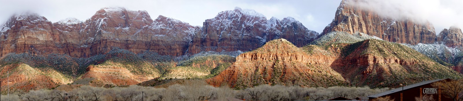
Zion National Park
Thursday, February 16
Monday, February 13

Friday, December 23

Monday, October 24
Tuesday, September 27


Sunday, September 18


Tuesday, September 6
Thursday, September 1
I Believe?
1. I believe that Freedom of Speech is fine, especially if someone is offended by it.
2. I believe that being politically correct is "censorship" and reflects societies lack of self-confidence.
3. I believe the Federal Government does a far better job of spending the money I earn, compared to City Government.
4. I believe oil companies' profits of 4% on a gallon of gas are ok as long as they pay tax on there 4%.
5. I believe that Portugal's drug policy has proven that decriminalization of drugs will not increase drug use.
6. I believe our government is not concerned about the thousand of American children that go hungry everyday, as long as the non violent drug offenders are locked up.
7. I believe illegal aliens have no right to stay here, but when we start paying five dollars for one apple or an orange I may change my mind.
8. I believe that business should be allowed to make profits for themselves and their rich shareholders, but they needed to start paying there share of tax.
9. I believe local, state, and federal Drug Enforcement are a bunch of losers that have been getting there buts kicked in the War on Drugs.
10. I believe O'Bomb'aa is doing a hell of a job with his promise of, "HOPE AND CHANGE", but it was not the kind of change I needed.
"They that can give up essential liberty to purchase a little temporary safety deserve neither liberty nor safety."
Benjamin Franklin
Subscribe to:
Posts (Atom)